Regardless of the merit of your data and ideas, the benefit of an aesthetically pleasing presentation cannot be overstated. In fact, the evidence is overwhelming; in the digital space, an oft-referenced study by the Stanford Web Credibility Project found that, “Nearly half of all consumers (or 46.1%) in the study assessed the credibility of sites based in part on the appeal of the overall visual design of a site, including layout, typography, font size and color schemes.”
Few of us are fortunate enough to have a designer’s talents to satisfy every visual design whim in our day-to-day reports and presentations. But the Leff Communications design team, Delilah and Jake, have a simple solution for improving the look and feel of your business communications: “Don’t underestimate the power of font,” Delilah says. “All fonts have a personality, and there are some easy ground rules for how to consistently create elegant, professional-looking documents and presentations.”
Typography 101: Serif vs. sans serif
In general, there are two kinds of fonts—serifs, whose letters and symbols include small, graceful lines at the ends of strokes, and sans serifs (French for “without serifs”), whose letters are simpler and unadorned with such lines. Both font styles date back to stone inscriptions in Latin, Etruscan, and Greek societies as early as the 5th century BC—but they weren’t categorized as serif/sans serif until after the introduction of the printing press in the 15th century.
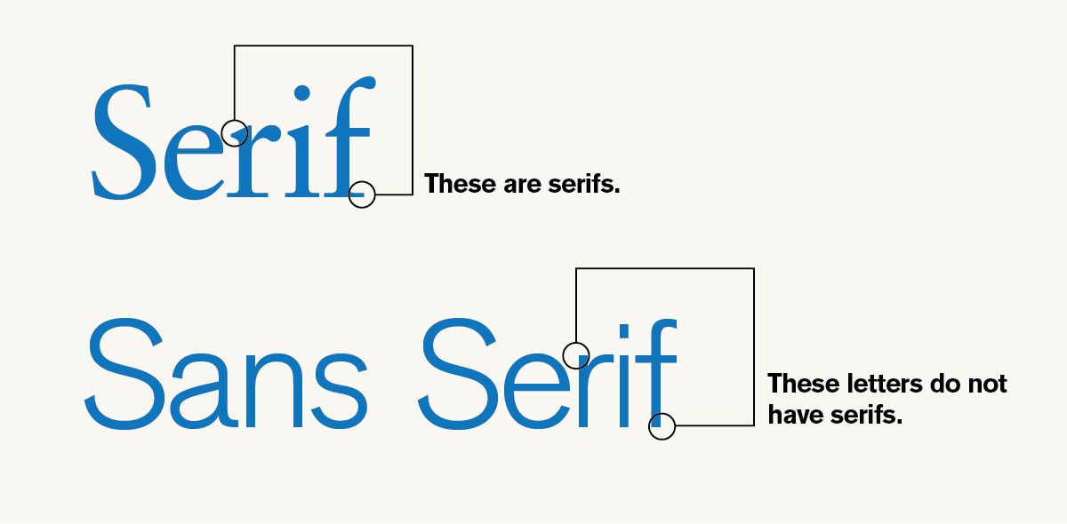
In modern typography, serifs are used to allow the reader move easier and quicker, as the notches help the eye travel along text. In contrast, sans serif fonts are used more often for bold lettering on signs and in most digital media. Well-designed business communications often use a pairing of both serif and sans serif fonts.
Typography 102: Let’s talk about fonts, baby
Have you ever received a document from a colleague, contractor, or client and found it’s riddled with sloppy word breaks, weird spaces, and awkward font shifts? That’s because the author used a font that your computer doesn’t have—resulting in incompatibility. For example, Helvetica comes standard on all Macs, but not on all PCs.
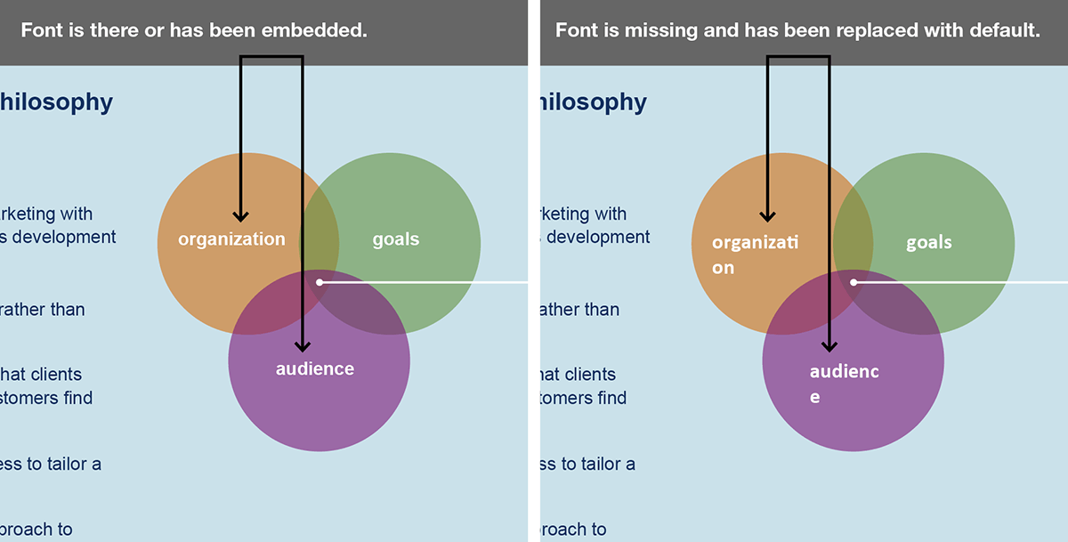
There aren’t many fonts that are standard on all computers; the list usually includes Arial, Comic Sans,* Courier, Georgia, Times New Roman, Trebuchet, and Verdana. If you’re creating a document that others will be able to edit, you’ll need to use one of these more standard, default fonts. Within Microsoft Office, Calibri (PC) and Cambria (Mac) are the new standard—but keep in mind that only people using Microsoft Office will have these fonts.
These default, safe-bet fonts are not the only fonts that you should ever use. As part of their branding strategy, many companies purchase font licenses for popular, non-standard fonts; for example, the Leff Communications logo uses the sans-serif Akzidenz-Grotesk. You can even get free, quality font downloads from Google. But remember: if you use non-standard fonts, be sure you’re only sending non-editable files, such as PDFs or PNGs, which embed the fonts or turn them into an image. Since the text will be static on the page, you have much more flexibility in font choice and design.
Pop quiz: PowerPoints
Are you sharing a PowerPoint with a client or colleague who won’t be editing the content? Before you hit “send,” embed the font in the PowerPoint dek or export the PPT file to a PDF. This ensures your fonts stay clean and gives you the flexibility to use non-standard fonts.
Typography 103: Choose a pair of fonts to use consistently
In any business communication—from presentations to resumés to e-newsletters—your font choice should not only look professional but also be easy to read and consistent across all your content collateral. Choose a pair of fonts and use them consistently throughout your communications. Delilah and Jake strongly discourage the use of more than two fonts on the same page or even in the same report; it can end up looking unprofessional and chaotic. Instead, work within font families, which often offer plenty of variety of weights and styles.
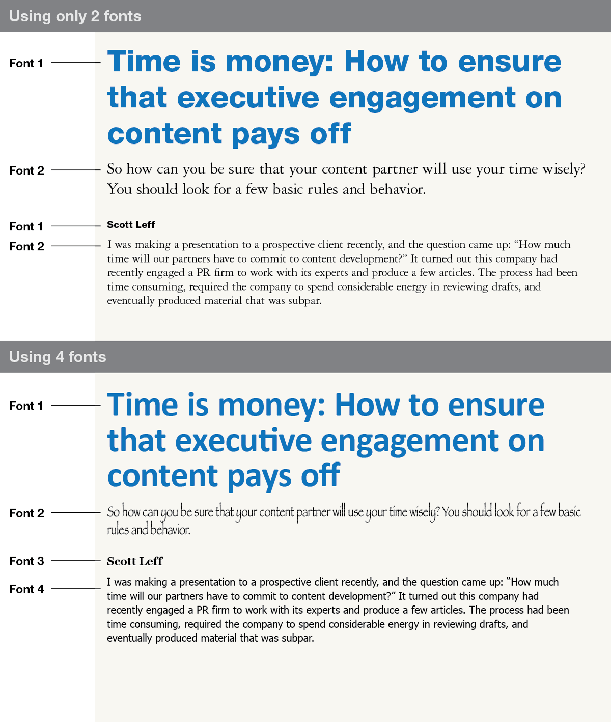
According to our designers, a good general rule to follow is to use sans serif for headlines, titles, or any bold-weight font and use a serif (Roman or italic only) for body text. One safe-bet combination is Arial (sans serif) and Georgia (serif). While these aren’t necessarily the best fonts ever, they are available on most computers and will ensure that your documents and presentations are tidy no matter who opens them.
If you are sending a static document (not an editable one; see Typography 102), Delilah recommends her favorite combination: Futura (sans serif) and Sabon (serif). Jake’s favorite combination is Helvetica (sans serif) and Garamond (serif).
[Note: After Delilah gave me her favorite combination, she mentioned half a dozen other fonts that she likes and uses often. The moral is that you don’t have to be a one-trick typographer; there’s room in every designer’s heart for multiple favorites.]—
If you keep these three ground rules in mind—fit the font style (serif and sans serif) to the function, use standard fonts in editable files and reserve non-standard fonts for static files, and pick two fonts to stick with—your documents and presentations will be a step above the rest.
*Never, ever use Comic Sans in business communications.
Leave a Reply
You must be logged in to post a comment.