Please note: All charts in this article are for illustrative purposes only, and the data is made up (except for William Playfair’s and Gerd Arntz’s charts).
To follow up on my last blog post, which was about pie charts (if you haven’t read it, it’s a pretty riveting piece that you should read here), this blog post is about bar charts. Or rather, my love and continuous devotion to all that is bar charts.
In full disclosure, I am writing this blog after having a couple of wines. I also love wine, as you may have read in the title, and I decided to use this love to help illustrate my points in the following charts.
To start off, I will take a sip of my Mirassou Cabernet Sauvignon (thank you, neighborhood 7-Eleven) and show you the pie versus bar chart example from my last blog. (Seriously, if you haven’t read it yet, click here.)
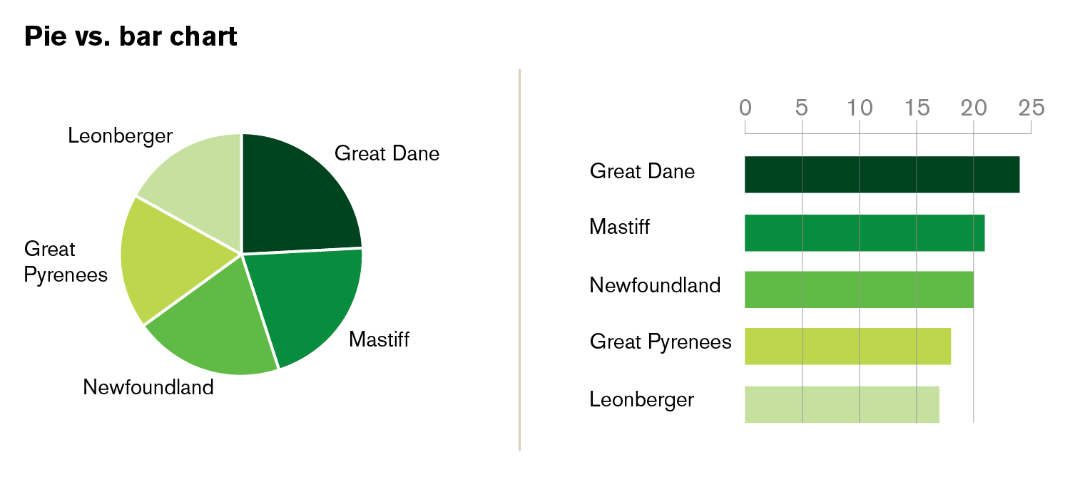 Already from this simple example you are able see how much clearer bar charts are. Your eyes can see the differences in the length of the lines better than the differences in the sizes of pie pieces. I could really just stop here, but there’s so much more to say about bar charts. I want everyone to understand why bar charts are the best and why I love them so!
A little history
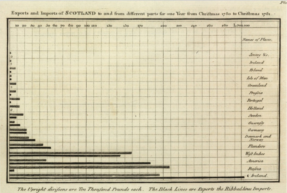
William Playfair, the same person who invented the pie chart, invented the bar chart. Playfair was a businessman, economist, and engineer. He invented the line, bar, and area charts in 1786. Below is his first bar chart. It shows Scotland’s imports and exports to and from 17 countries in 1781. Isn’t it a beauty?!
Why bar charts are the best
Bar charts are the best because everyone instinctively knows how to read them. Bar charts make the data clear instantly because they are simple, straight lines, and your eyes process simple, straight lines immediately. Hands down, bar charts should be the most-used charts in your business presentations and communications.
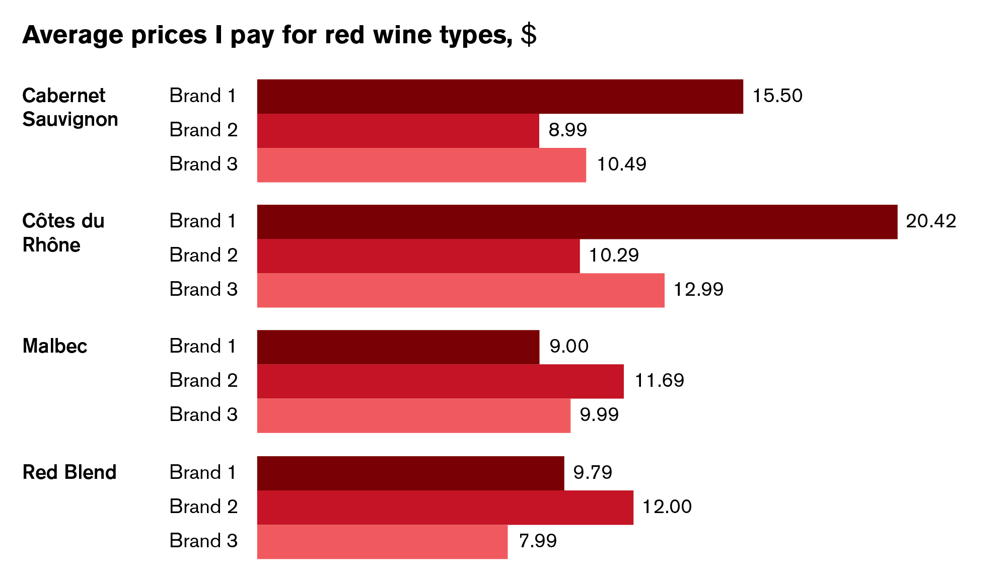
Here is a simple bar chart.

Since you can see the message very clearly, you now know that Cabs and Côtes du Rhônes are my top favorite red wines.
The benefits to bar charts don’t stop there. They are my favorite kinds of charts because they are flexible and can be designed in an endless variety of ways. The following examples show some of the versatility of bar charts.
In these charts, you can easily compare multiple items to each other at once.
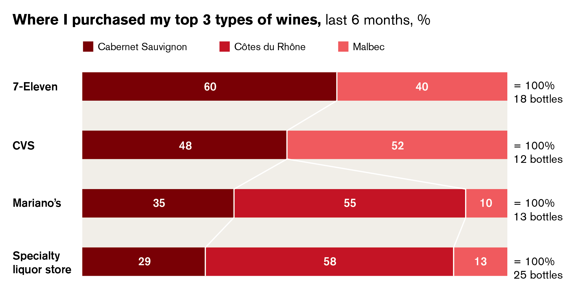
Another variation is the segmented bar. Segmented bar charts are amazing because they make it easy to compare data sets. You can also use these instead of creating four pie charts to compare. In this way, you can just follow the lines instead of jumping from pie to pie to pie to pie. See the beautiful chart below.
In the example below, you can see how bar charts can be used to show positive and negative values.

As you can see very clearly in this chart, I do not like white wines at all. Besides conveying this critical information, this example also shows another variation of the bar chart: adding a scale. This is especially useful if you don’t want to put in the actual numbers. Readers can quickly grasp the general message without needing to know the specific data points.
Bar chart abuse that stabs me in the heart
Some think bar charts are boring, which makes me sad because they are beautiful in their simplicity. This attribute is also the main reason that bar charts are abused by added decorations, wacky shapes, or even just making them vertical columns.
Let’s start with the column chart. This is a kind of bar chart, but I consider them quite different from bar charts and only use them in specific situations. (Stay tuned for an upcoming blog post on column charts! Likely to be titled, “Reading the straight and narrow: Column chart best practices.”) Labels in column charts often end up with hyphenations or at an angle, both of which can be distracting and awkward.

These designs can appear messy, annoy readers, and make things awkward to read. Not to mention, all of this can affect how quickly your message comes across. So, if a label is too long for a column chart, just flip it to be a simple horizontal bar chart. See the redesigned example below.
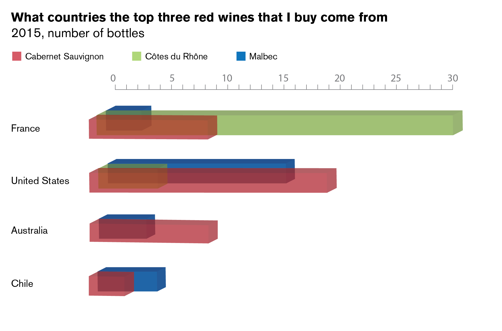
Another variation of the bar chart that drives me crazy is the 3-D bar chart. Just as with 3-D pie charts (read previous blog here), this is extra decoration that can create visual distortions or skew the data. See the example below where bars are behind other bars in a three-dimensional space. There is a light transparency in this chart, but you have to really focus to see it. Most people do not have the time or patience to make sense of over-designed visual craziness.
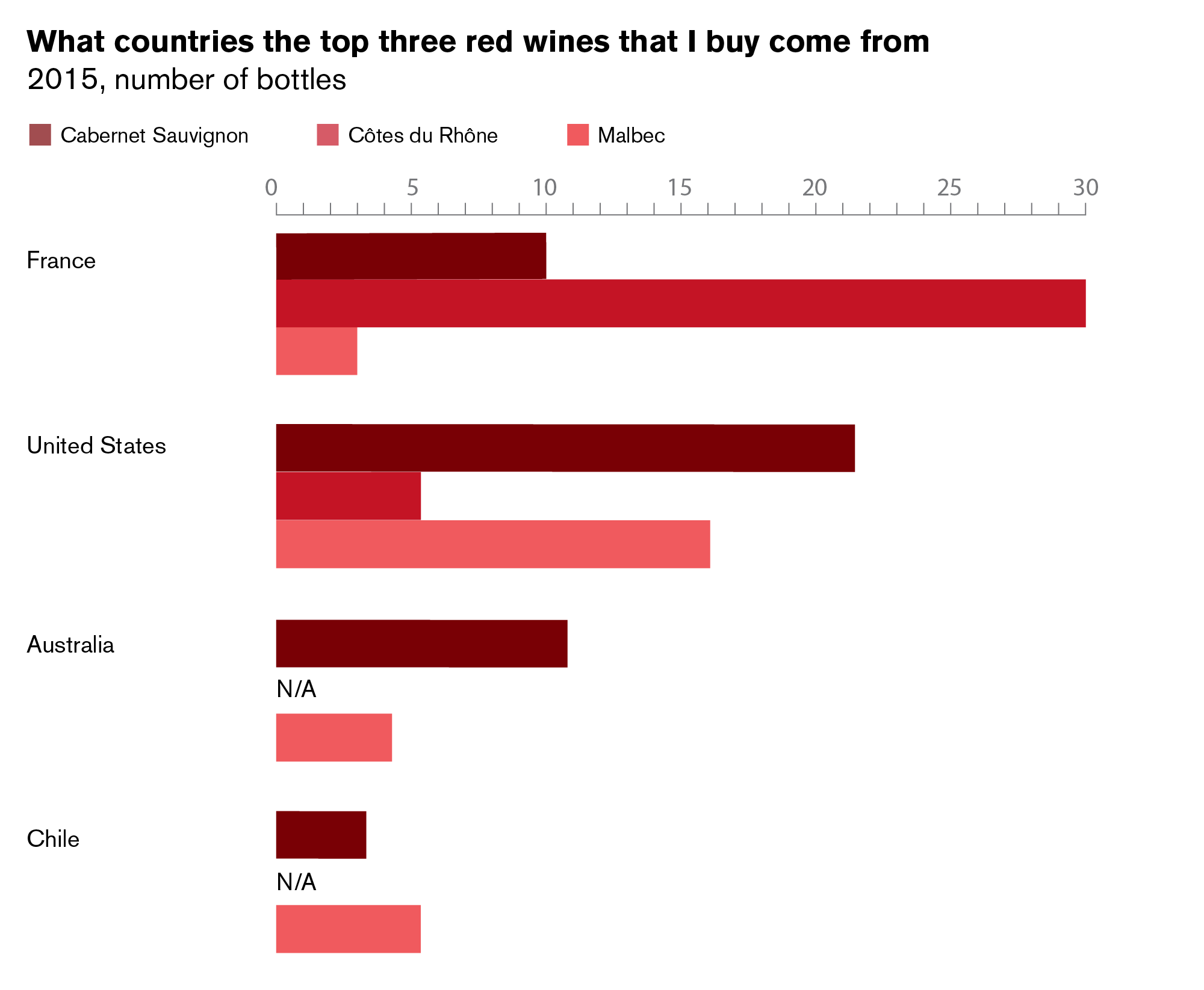
Here’s the right way. You can see everything. No hide and seek games.
And one of the most ridiculous variations of all (which I unfortunately have been seeing a lot) is the radial bar.
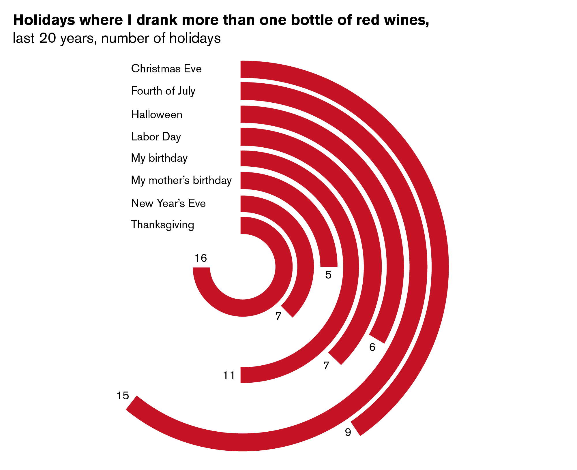
Sure, they are kind of pretty to look at, but just like on a lady, pretty curves can cloud the eyes and distract you. Bar charts should be simple and strong like the straight steel beams that hold up a building. Why? Because human eyes read straight lines quickly and easily. With curved lines, each rounded bar sits on a different radius, so the lengths can be misconstrued. If you look at the example above, the bar on the inside is meant to represent the highest value. However, if you straightened the lines as they are (as in, make it a bar chart), you would find that this is actually shorter than some of the lower values. This is the great failure of radial bar charts.
Here’s the same chart redesigned into a simple bar chart. Again, a simple bar chart design is the clearest and easiest to read.
Last, please for goodness sake don’t try to be clever and make bars into images like the example below. It’s just obnoxious.
A well-trained graphic designer can help you come up with a visual style if you would like something like this. For example, see Gerd Arntz’s work below (and visit a website of his work here). He created simple pictograms related to the content, resulting in a chart that is clear and sophisticated yet playful. Work with your favorite designer (me!) if you would like anything like this.

Some simple rules for good bar chart design
Bar charts are not very difficult to create (another reason why I love them so much!), but as we’ve seen, there are ways to mess them up. Here are some simple best practices to keep in mind:
1. Use clean and legible typography. NO COMIC SANS or other crazy font nonsense.
2. Use proper spacing and alignment so that labels and bars are at consistent starting points and aren’t too crowded.
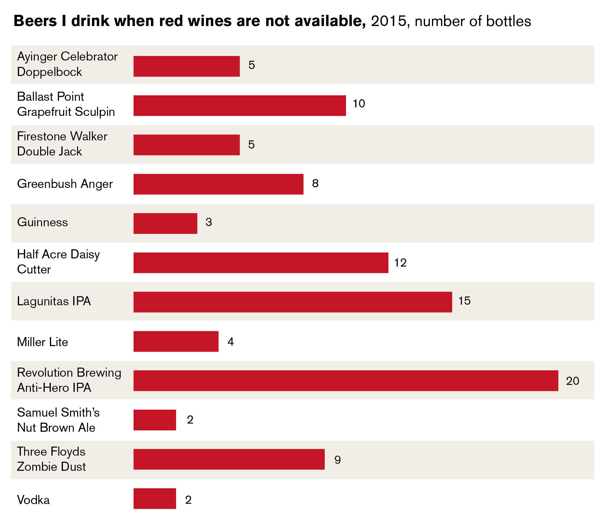
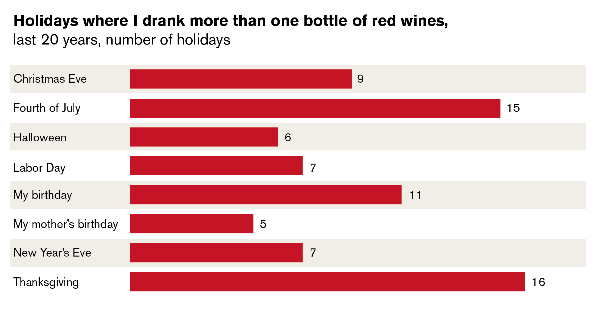
3. If there are more than seven or eight rows, use alternating shaded bars so that it’s easier to read across the chart.
4. If the data all have the same unit of measure and the numbers are relatively close, try to keep multiple bar charts in the same scale throughout your presentation, document, or article.
5. Don’t use the 3-D function in any of your programs.
******
After all of this, if you think that the simple, but visually effective, bar chart is still too boring, then you must understand that overdesigning comes at the cost of your data and could be considered unethical. Caring more about visual representation than honesty suggests a person is shallow and empty, like the wineglass I’m holding.
Leave a Reply
You must be logged in to post a comment.