Continuing my chart blog series, today I’ll be discussing the column chart. If you have not read my previous insightful blogs in this series, please read how pie charts should be used (and all the ways they shouldn’t be used) here and why bar charts are the best charts ever here.
Column charts look and act like bar charts in many ways but their applications are more similar to line charts. In fact, since they look and act as bar charts do, column and bar charts tend to be lumped together and collectively referred to as bar charts. However, I make a clear distinction between the two because I use them for different purposes, and you should too.
As a rule, I use column charts for just a select few purposes, and they all have to do with time: to show data comparisons over a chronological period of time, such as months or years; to show data over age or numeric ranges; and to show stacked data, such as pieces of a whole, over time.
Showing changes in a single variable over time
Before studying the next example, you should know that I am on a bar trivia team with some friends, and we play almost every Sunday night. Our team is called “The Stonecutters,” as in the secret organization from The Simpsons TV show, and usually we do awesome! This chart shows my trivia-night wine consumption in the fourth quarter of 2016. (As mentioned in previous blog posts, the data in my example charts has been mostly fabricated.)
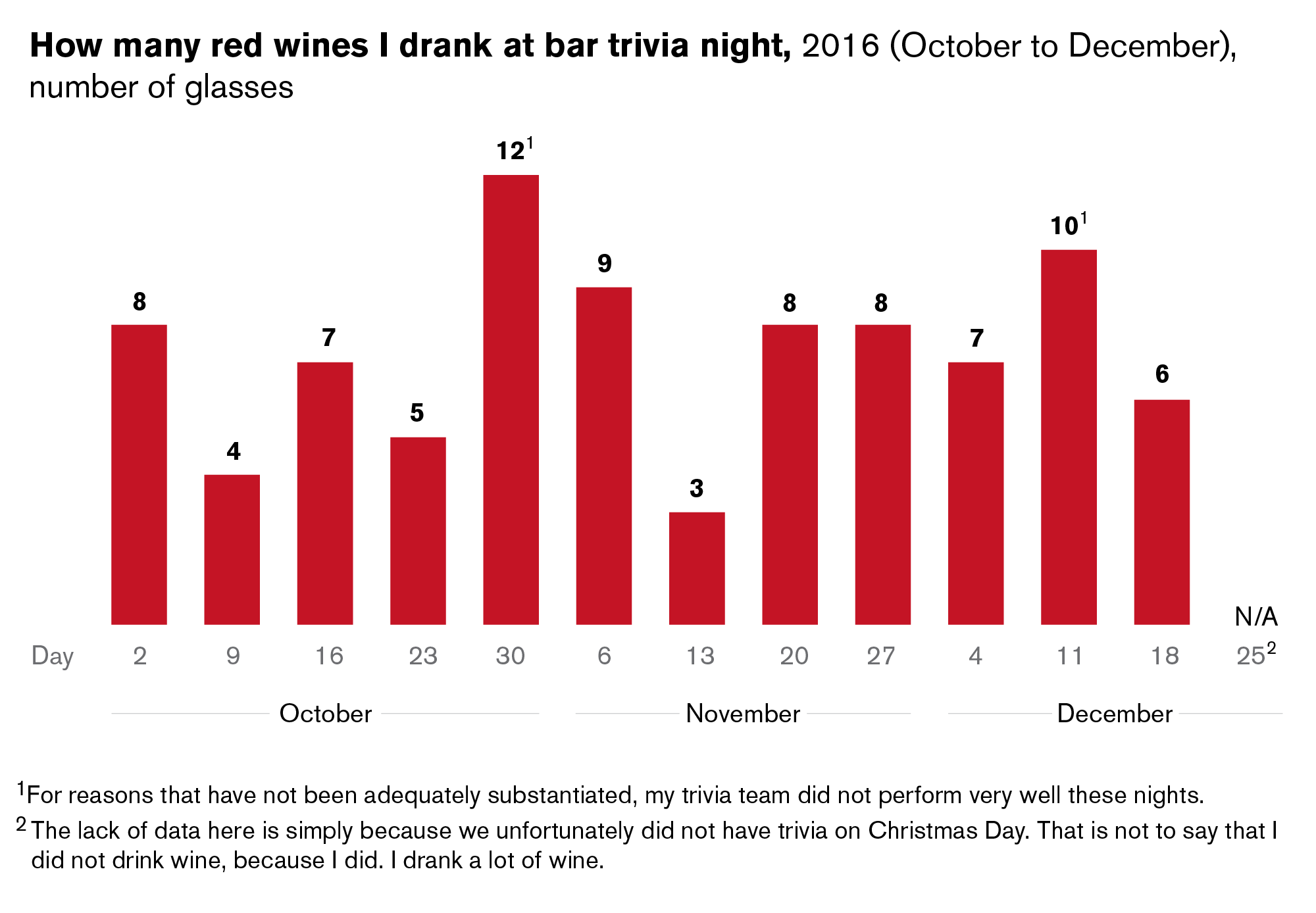
As you can see, it’s very easy to see the fluctuations in numbers over time in this column chart.
Comparing changes in multiple variables over time
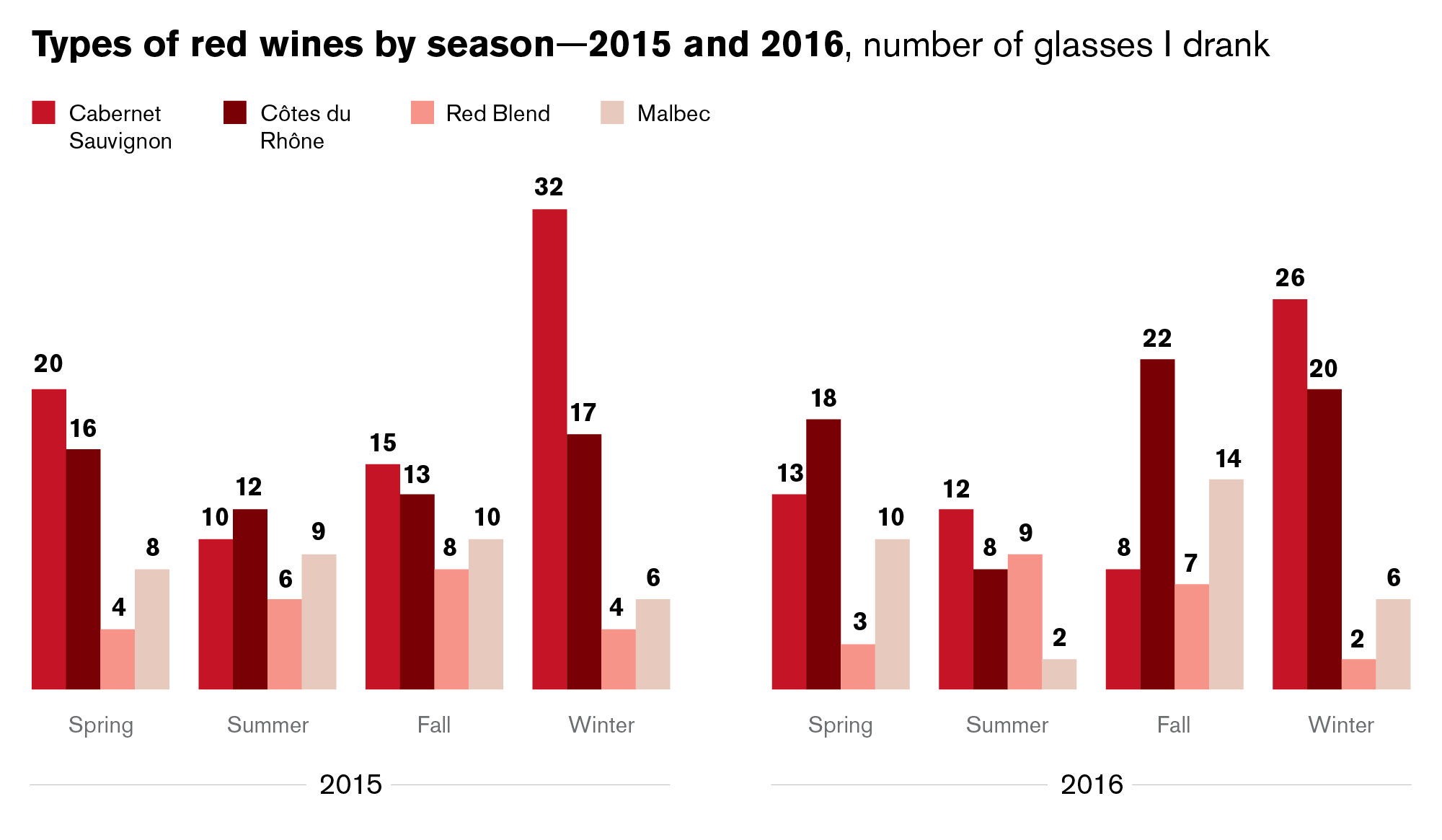
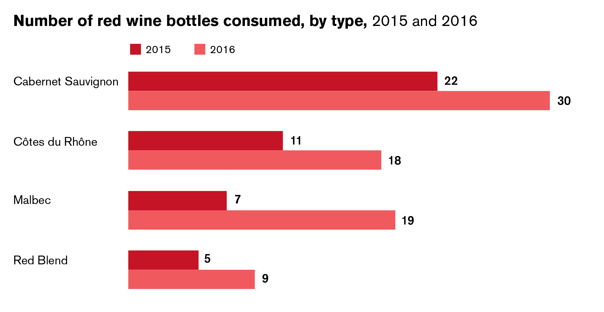
You can also use column charts in the same way as bar charts to compare multiple things to each other over time. In the examples below you can see a horizontal bar chart comparing red wine prices to each other over specific criteria. Below it, you can see a column chart comparing similar types of wine I drank over a specific time period. The introduction of time as a factor makes the second material more appropriate for a column chart.

Comparing stacked data over time
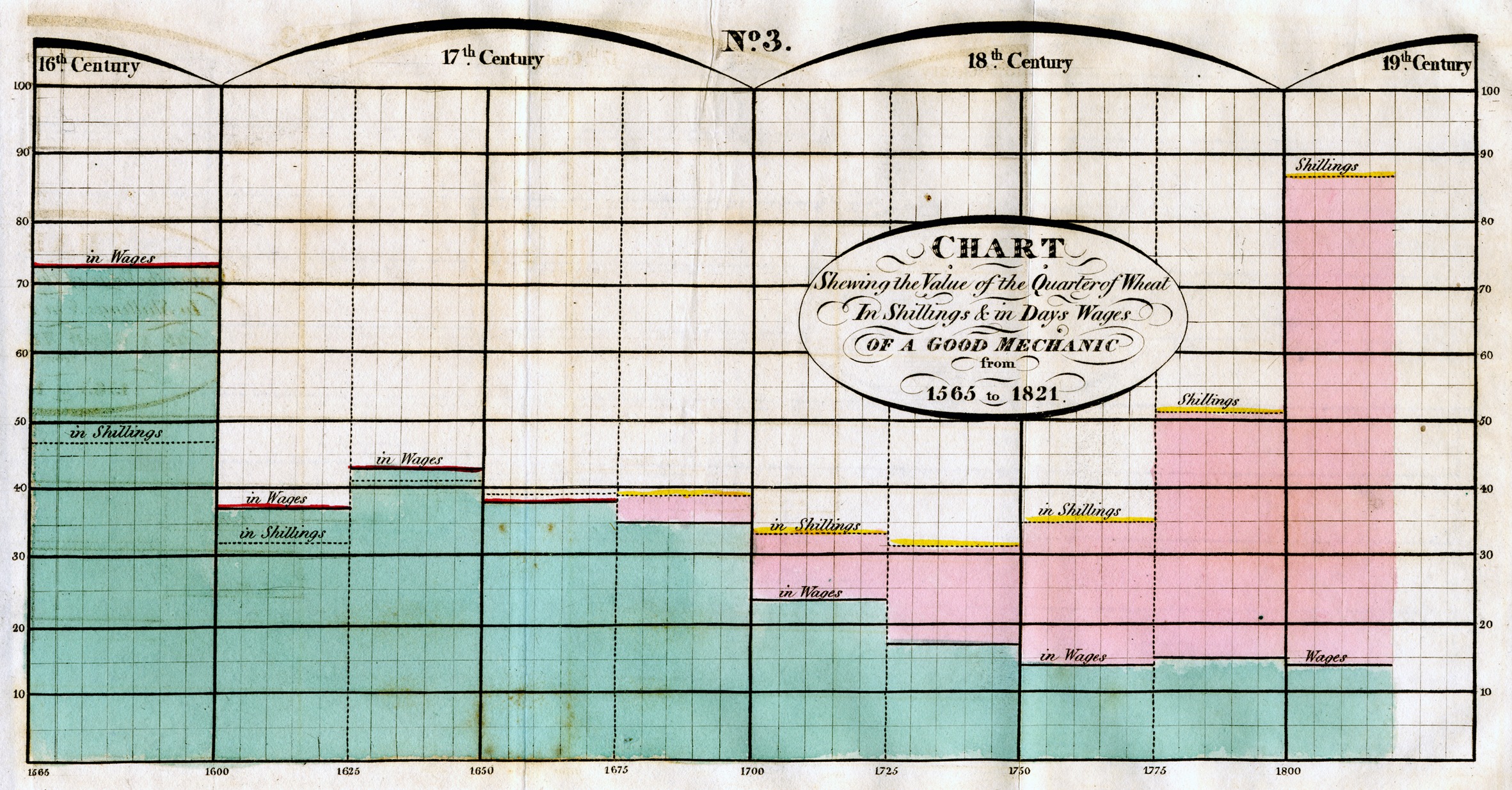
If you have read any of my previous chart blogs then you know that, besides the fact that I like my red wines, William Playfair has been attributed with inventing a lot of the chart types that we use today, including the bar and column charts. Here’s one of Playfair’s first column-like charts in which he compares the cost of wheat with mechanics’ wages over time, from 1565 to 1821.
Column charts are indeed great for showing and comparing stacked data over time—either percentages or pieces of a whole—as Playfair does above. In a similar example below, you can clearly see how the average percentages of my top five consumed beverages changed as I grew older—less beer, less vodka, more wine, more La Croix.
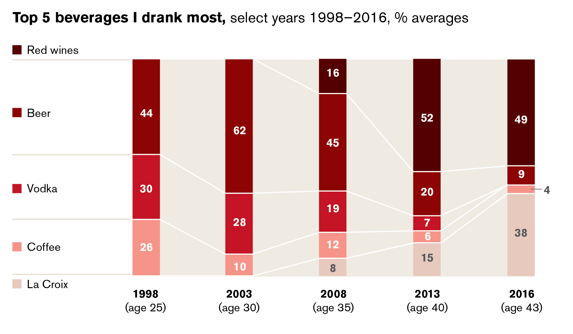
From this chart, you might think I am trying to cut down on my drinking by consuming more La Croix. However, since each column shows percentages of a whole as opposed to whole numbers, you really don’t know for sure if I’m drinking less alcohol or simply drinking more of everything. Percentages can be great for instances like these when you might not have or do not want to share exact figures.
And now you’ll never know if I’m drinking less wine now than I was three years ago. Then again, if the themes of my chart posts are any indication, you probably have your suspicions.
Choosing between column and bar charts
Even though bar and column charts kind of work in a similar way, you shouldn’t just use them interchangeably. When comparing data over time, a reader will register the information more quickly when it’s presented from left to right as it is in a column chart. (More about this point in my next chart blog post about line charts.) Why? First of all, in this part of the world, we instinctively read left to right, top to bottom because that’s how we’ve been trained. And second, most people see time as going in a straight line forward—again, from left to right.
That said, there is one instance in which I choose to put years in a horizontal bar chart instead of a column chart. When you’re comparing something and the years are merely a secondary factor, a bar chart can be more straightforward. See the example below:
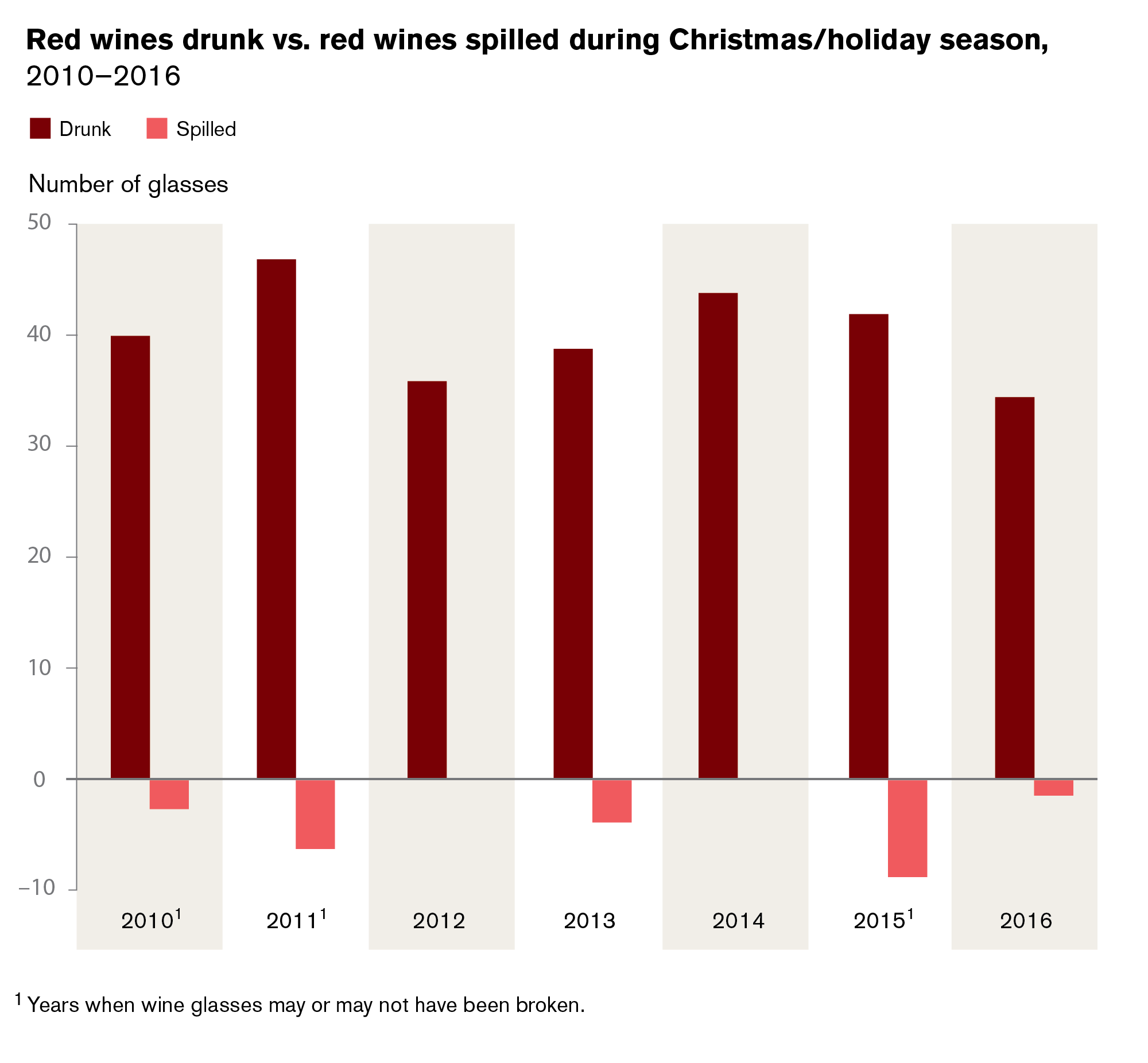
Many people also think that column charts are more effective at depicting negative numbers than bar charts. While this may be true since you can show negative numbers falling below a baseline, I still believe column charts should only be used in the place of bar charts when you’re showing chronological periods of time and descriptor labels are short/numeric. See the example below for a negative column chart that works. It’s about how many glasses of wine I spilled during the Christmas holiday season because I am clumsy. Below that you’ll see a successful negative and positive chart that is not chronological and therefore works better as a horizontal bar chart.

—
And there you have it. Hopefully you can now comfortably choose between bar and column charts—and defend that they are, indeed, distinct chart types. Bottoms up!
Leave a Reply
You must be logged in to post a comment.